Hanboard
Hanboard increase Cakap's Mandarin course revenue grew 42.40% and active students grew 8.82%.
Role - Team
Product Designer - PM, Analyst, Researcher, Writer
Impact
Date
Mar 2024
The Outcome
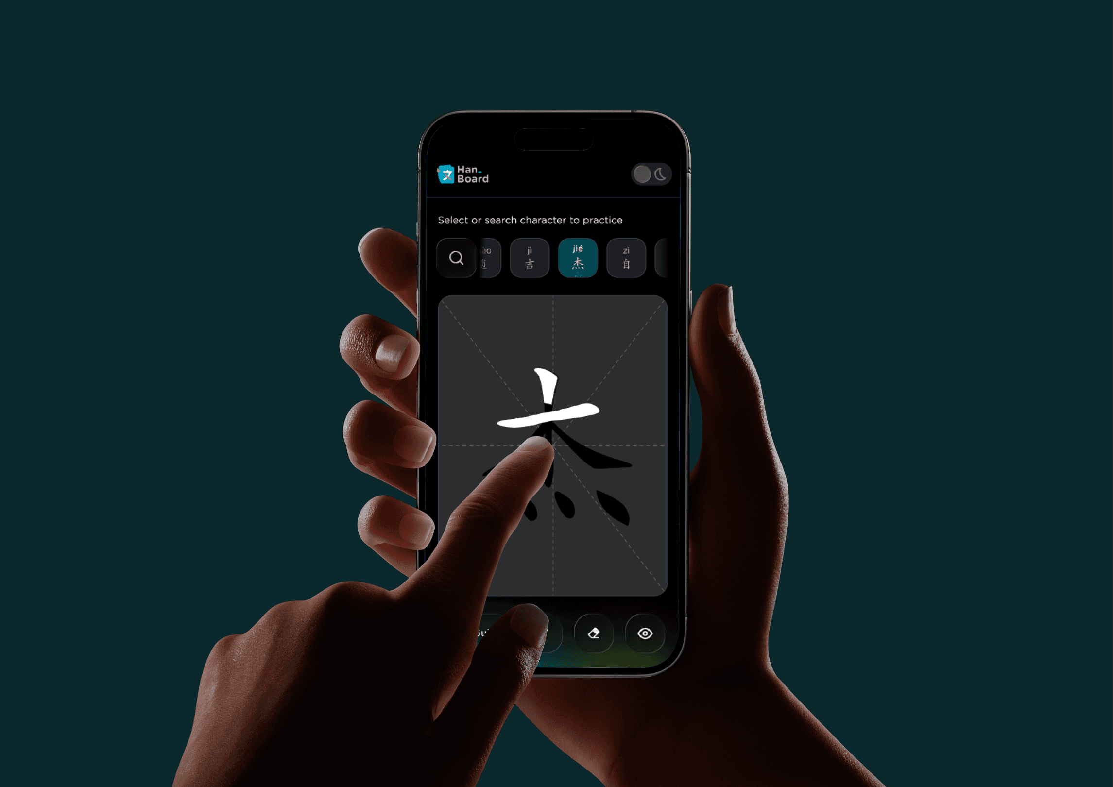


The final design reflected that split cleanly: teachers observe and guide on desktop, while students practice on mobile using animated guides, traceable overlays, and touch-native input. Hanboard was also embedded into the Mandarin placement test and assessment flow.
Since the placement test includes a writing exercise to help determine each user’s proficiency level, every student encounters Hanboard before joining a course. This also gives teachers a structured opportunity to use it as part of their evaluation toolkit, removing the friction of introducing a new tool mid-session in a live teaching environment.
Try Hanboard
Business Context
Cakap Mandarin course available for Adults & Children, offering an interactive and engaging way to learn Mandarin. It focuses on developing listening, speaking, reading, and writing skills. The course uses professional teachers to deliver fun, real-time online sessions that encourage active participation and enhance language retention.
What We Were Trying to Solve
Students couldn't write characters correctly on their own not because they weren't trying, but the platform gave them no guidance on how to do it right. Teachers couldn't intervene effectively because they had no real-time view of a student's stroke process only the finished result, if visible at all. The feature should focus on enhancing stroke recognition accuracy and overall usability. This will make learning more effective and engaging for students while allowing teachers to guide the writing process more efficiently.
My responsibilty was to design Hanboard a dedicated Mandarin stroke feature embedded in the live session environment, built for both the student practicing and the teacher guiding.
What the Research Pointed To
Our researcher conduct a competitor analysis for stroke-learning tools across language platforms, focusing on one question:
Both patterns addressed the same underlying problem: beginners need to see the correct behavior modeled before they can replicate it. Static reference images don't provide that. Two patterns were consistent:
Animated stroke guides

Showing correct stroke order in motion, not as a static diagram. Beginners need to see the sequence before they attempt it. A static reference image doesn't provide that mental model.
Traceable shading overlays
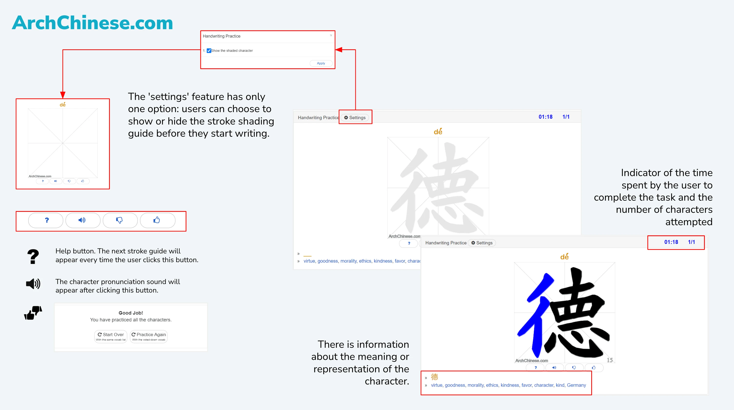
A hide/show overlay that let students trace over a faded character before writing independently created a scaffolded practice loop. Students could build muscle memory before being asked to perform without support.
The Design Decision That Testing Forced
The core design challenge was dual-surface Hanboard needed to work on desktop for teachers managing a session, and on mobile for students doing the actual writing. Early wireframes tested both surfaces in parallel. Lo-fi prototypes were built for usability testing before any high-fidelity work began.

Our researcher moderated testing with 5 participants across two audiences adult teachers & learners and children since Hanboard is used by both age groups in Cakap's course structure. Sessions were split by device:
Desktop Lo-fi


Desktop Usability Testing Results
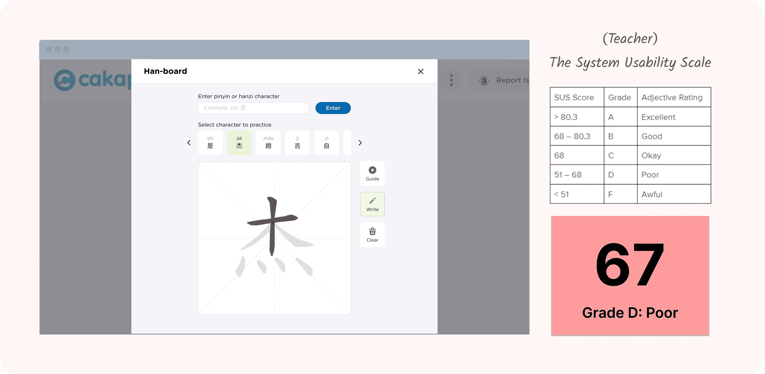
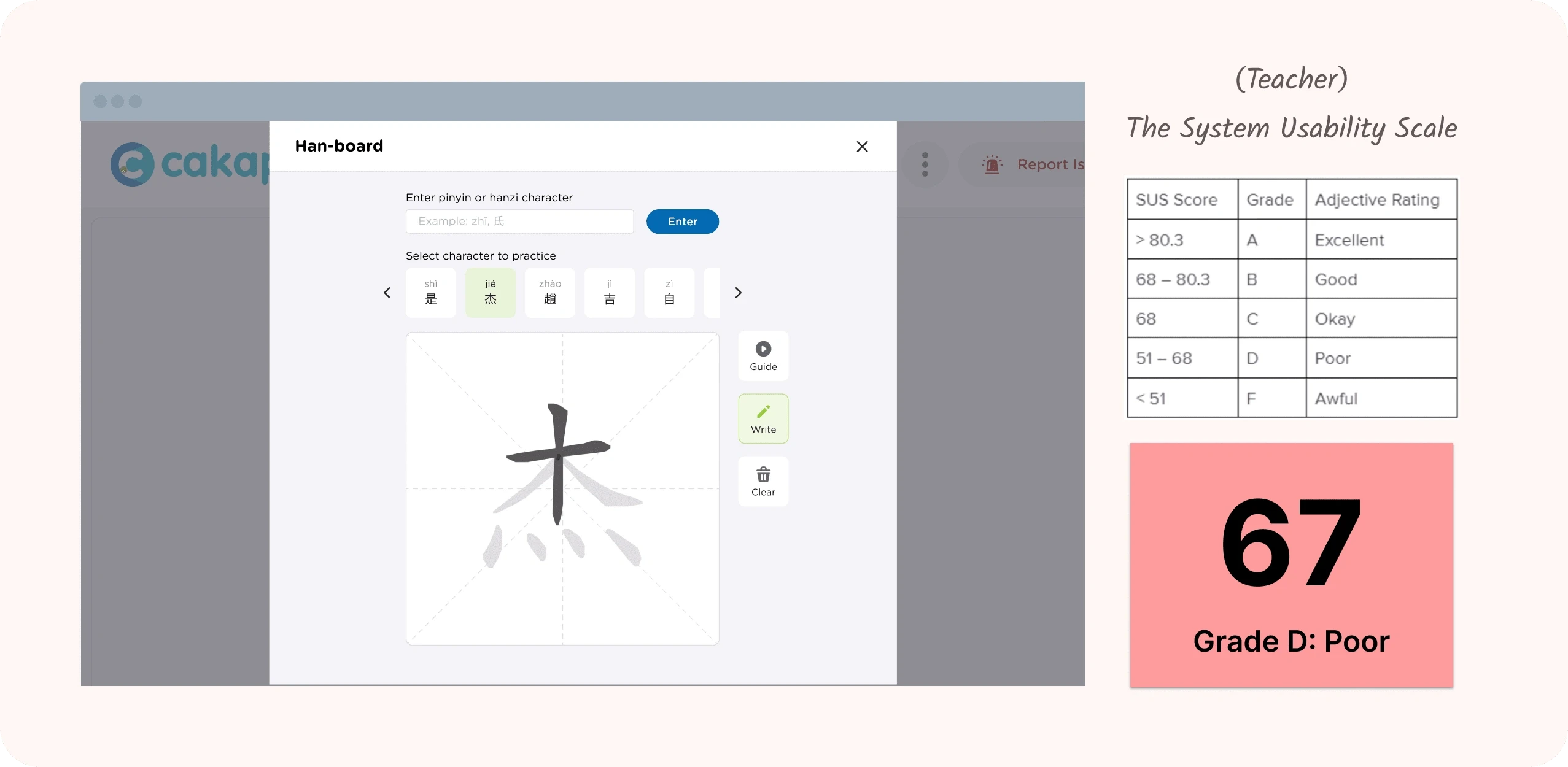
Every participant found writing with a mousepad on desktop uncomfortable enough to undermine the task. The physical act of dragging a cursor to form a character created friction that had nothing to do with learning Mandarin it was just a bad input device for this job.Student and teachers found it uncomfortable to write/stroking/dragging using mouse pad.
Student and teachers found it uncomfortable to write/stroking/dragging using mouse pad.
Users struggled to identify and rectify errors in their strokes due to a lack of clear and immediate feedback from the prototype.
The flawed stroking experience negatively impacts user confidence when exploring the task.
Mobile Lo-fi

Mobile Usability Testing Results

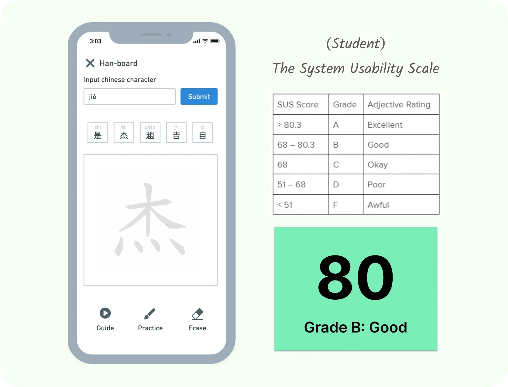
On mobile, the experience was meaningfully different. All participants preferred the touchscreen for stroke input, because writing with a finger maps more naturally to writing with a pencil than dragging a cursor does.
The mobile prototype was tested by all participants preferred the mobile prototype over desktop, as touch-based writing feels significantly more natural and comfortable than using a trackpad.
The heavy visual weight on the "Submit" button misleads users into focusing on search rather than the core writing canvas, disrupting the character selection flow.
Meanwhile, both learner seem less interested in the visual appearance on desktop or mobile.
Proposed UX Solutions
Optimize Canvas Interaction per Platform
Shift primary writing tasks to Mobile (leveraging intuitive touch gestures) and adapt Desktop for non-drawing tasks (like stroke animations or keyboard-based learning) to remove input friction.Implement Real-Time Feedback & Guidance
Provide immediate visual cues for stroke order accuracy (correct/incorrect color indicators) and easy error-correction tools (Undo/Erase) to build user confidence while practicing.Re-align Visual Hierarchy for Searching Keyword
Replace the search input and heavy "Submit" button with button icon Search for search Hanzi or Pinyin make it real-time auto-suggest once clicked, shifting the main visual weight (primary action color) directly onto the practice canvas.
This wasn't a preference finding. It was a constraint. It meant the student-facing practice surface had to be mobile-first not as a nice-to-have, but as a functional requirement. The desktop experience was redesigned around teacher visibility and session controls.
The clearest path forward is embedding Hanboard into the Mandarin placement test and assessment flow. That makes every student encounter it before joining a course, and gives every teacher a structured moment to use it as part of their evaluation toolkit removing the friction of introducing a new tool mid-session in a live teaching environment.
Design Results


Guide

Search

Write

Edge Case

Hide Character

Complete Page
What I Learned
Physical input is a design constraint, not a preference.
Touchscreen writing is categorically better than mousepad writing for stroke learning. That finding should shape how Hanboard is prioritized and surfaced across the platform going forward.Launching and integrating are two different problems.
A feature available to teachers is not the same as a feature built into how they teach. The next phase of Hanboard is less about design and more about making it structurally unavoidable in assessments, in onboarding, in the course flow itself.Scaffolding reduces the performance gap.
The animated guides and traceable overlays weren't aesthetic choices they were the mechanism that let beginners attempt stroke writing without needing a teacher to intervene on every character. Building that scaffolding into the tool is what made independent practice possible.