Revamp Cakap LMS (Learning Management System)
Improving the mobile learning experience, increasing learning progress rate by +48.67%, and preparing the platform for future AI features.


Role - Team
Product Designer - PM, Analyst, Researcher
Impact
Date
April 2026
Project summary
The Core Problem
We facing a problem with stuck average learning progress by 37%. A mobile-first audience (64%) encountered severe responsive scaling issues due to the legacy desktop-oriented interface. This viewport mismatch created high interaction friction, contributing directly to user drop-off and low completion rates.
Why It Matters to the Business
When users drop out without completing their classes, customer satisfaction declines, and fewer users return or recommend the app. Additionally, outdated systems make it difficult to support AI-powered tools tailored to different types of learners, including teens, professionals, and corporate teams.
The Goal & Outcome
The team redesigned the mobile app to make learning effortless and clear, lifting course completion to 48.67% (beating their 41.67% target), while streamlining the back-end system to lower maintenance costs and prepare the app for future AI features.
Solution
Designing for Real Behavior Turning Ergonomics & Instant Feedback
Designing Mobile Controls Where Attention Actually Lives
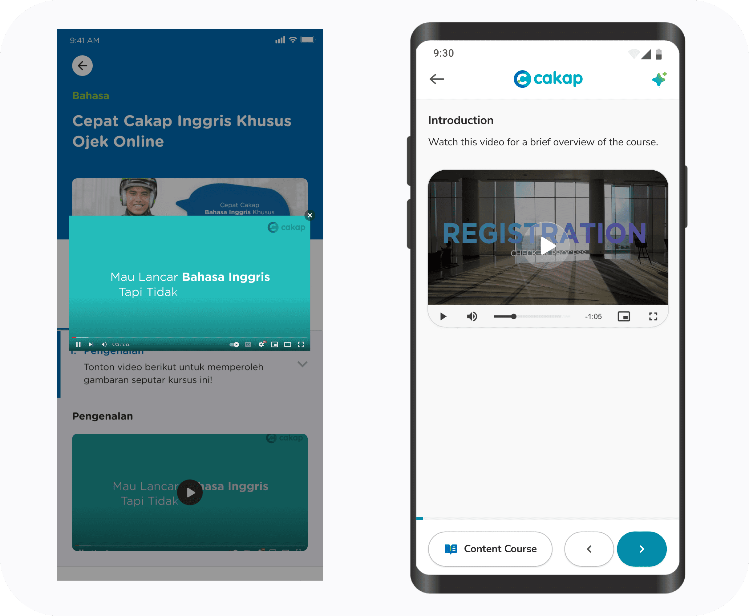
Designing mobile controls (like Previous/Next buttons) at the bottom of the screen where thumbs easily reach, rather than hiding them at the top.
Reduce Friction Learning by Replacing Modals with Inline Flow & Progress Reassurance
Replacing disruptive pop-up windows (modals) with seamless inline reading, keeping learners focused on the lesson content.
AI-Ready Architecture Structuring Seamless LMS Navigation for Long-Term Growth
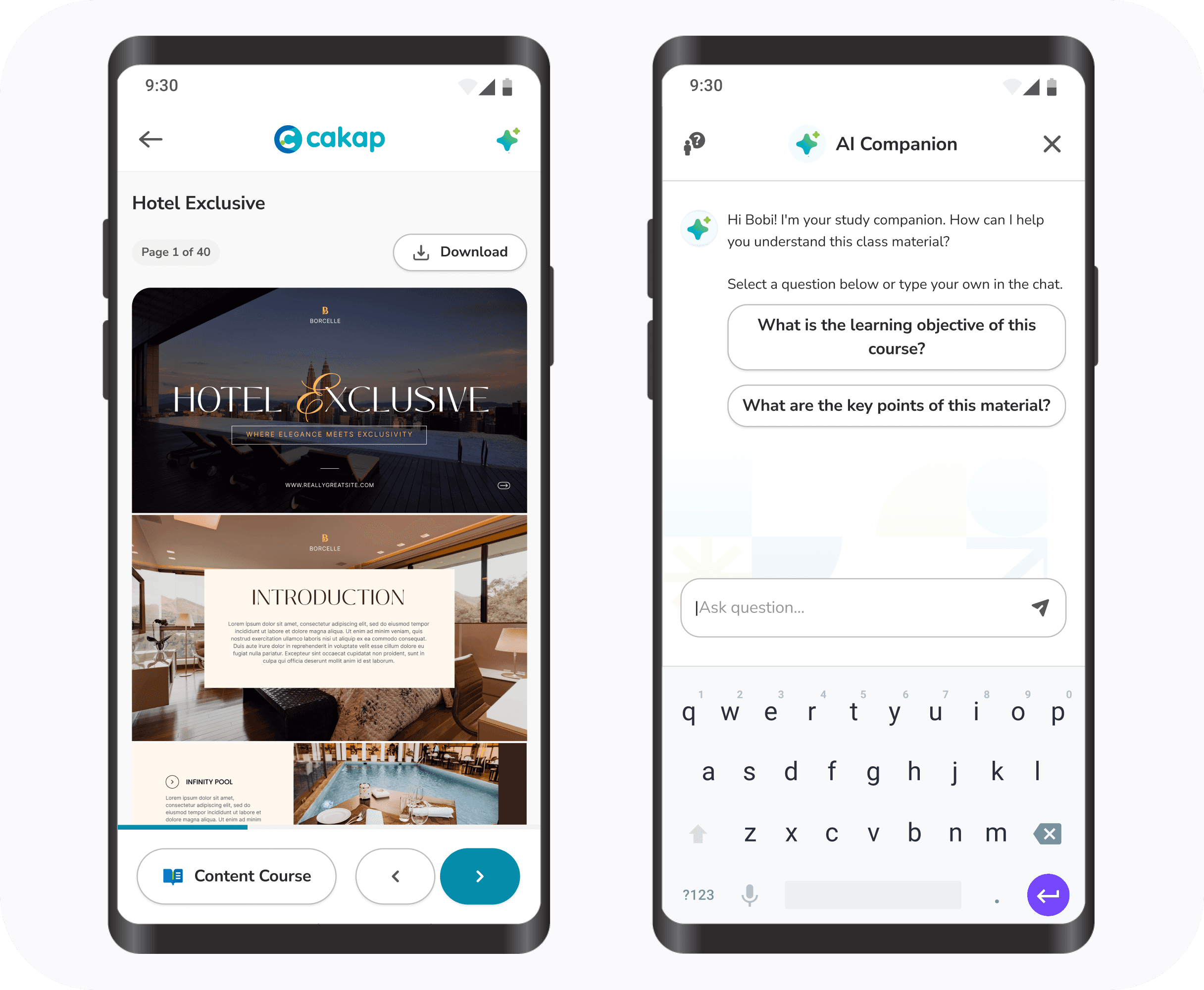
Building a flexible interface architecture that leaves dedicated space for future AI tools without cluttering the main reading view.
strategy approach
Collaboration between Researchers, PM's and Business Unites
We define how learners encountered increasing friction while navigating courses, and the product architecture wasn't flexible enough to support upcoming AI-powered capabilities.
Product Analytics
The analytics confirmed where the biggest opportunity was. Avg.Learning Progress Rate 37.04% (July 2025) and 64% of learners used mobile as their primary device. The mobile experience became the highest priority.
Product Mapping
Mapped the existing learning flow across desktop and mobile. The review showed the learning experience is not mobile friendly . Learners spent unnecessary effort managing the interface instead of focusing on the lesson itself.
Review Existing Research
Reviewed previous user research, especially a learner segment internally known as The Quitter. These learners enrolled in courses but rarely completed them. They simply encountered too much friction during the learning process.
Discovery Problem
I wanted to understand whether the low learning progress was caused…
Before exploring solutions, I wanted to understand whether the low learning progress was caused by user behavior, interaction design, or the platform's underlying structure. To answer this, I combined a few discovery methods to identify where learners experienced friction and validate the direction of the redesign.
Experience Audit


Research
Researching the LMS landscape and current product on the market to understand how modern LMS platforms structure learning experiences. Three patterns consistently appeared:

Learning materials are displayed inline instead of inside modal windows.
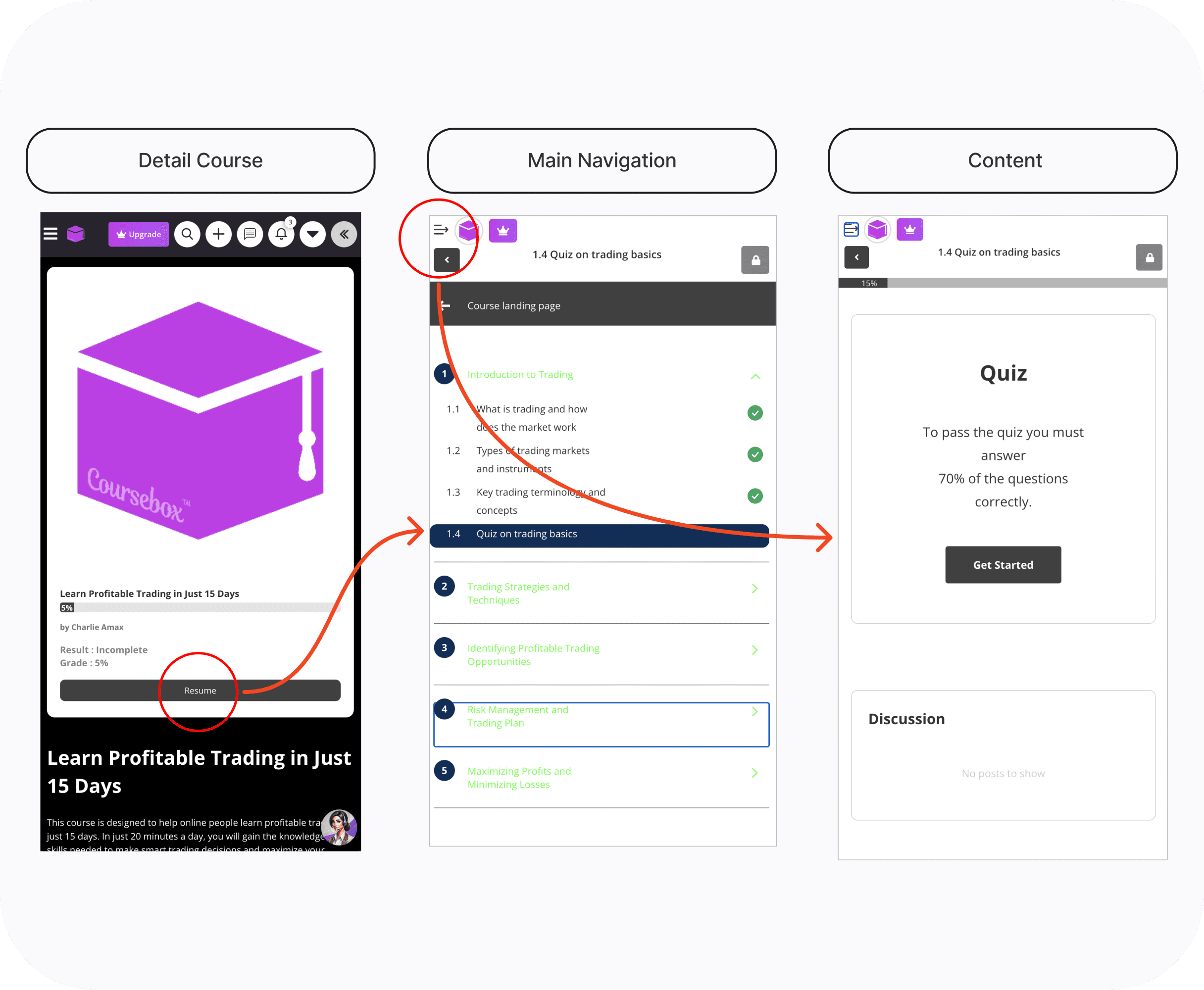
Dashboard and learning pages are separated into different contexts.
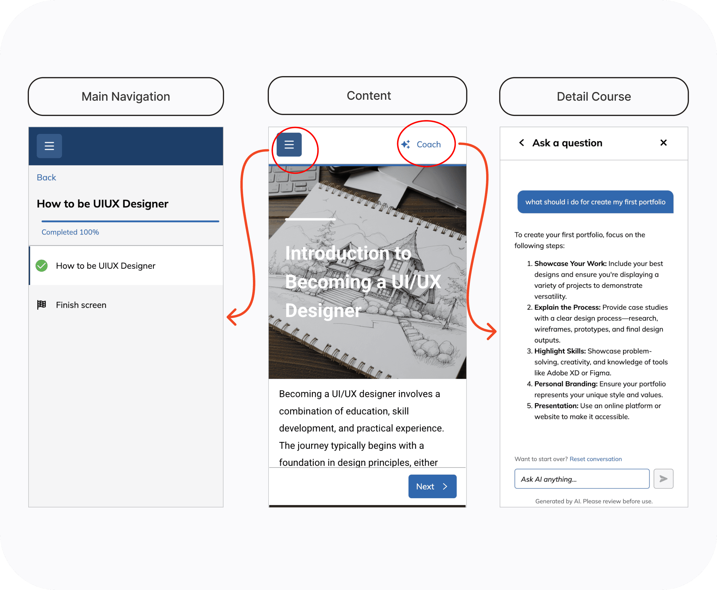
AI features live in dedicated area instead of competing with learning content.
design Opportunity
How redesign the learning experience to reduce friction, improve learner engagement, and creating room for future product growth?
product mapping
How can learners move through lessons with the least amount of effort?


I'm mapping the big picture for design architecture concept navigation strategies. One insight from the discovery phase became the foundation for the exploration:
Hypothesis Concept
If we reduce the number of taps required to open a learning material from 3–4 taps to 1 tap, learners will be able to access their materials faster and with less interaction friction, making it easier to start learning and reducing the likelihood of drop-off.
With this in mind, I explored three navigation strategies. Each concept optimized for a different design goal while balancing usability, discoverability, and long-term scalability.
exploration core idea
Exploring product direction
We conduct a quick early tested for all idea concept with 5 internal users. 4 out of 5 struggled to find the swipe gesture in Concept 1 and 2, which validated our decision to pivot to Concept 3


Concept 3 — Explicit Action Hierarchy (Selected)
The final concept organized actions by frequency of use. Primary actions (Previous and Next) were placed within the thumb zone, while secondary actions such as the course menu and AI tools moved to the top of the interface.
Why should it exist this way??
Unlike the previous explorations, this concept balanced three priorities simultaneously:
Reduced physical effort for the most common interaction.
Made navigation immediately discoverable without relying on hidden gestures.
Established a scalable layout capable of supporting future AI-powered learning features.
This created a clear and predictable interaction model where the next learning action remained visible throughout the session. I optimized for the lowest interaction cost. The goal wasn't simply to make navigation easier it was to reduce friction at the exact moment where learners were most likely to abandon the learning flow.
other Opportunity
Separate LMS from detail courses

The redesigned experience clearly separated browsing from learning, reducing cognitive load and making navigation more predictable.
Integrating AI into the LMS Navigation
Restructured the LMS navigation to support upcoming AI-powered learning features.

I ensuring AI is easily accessible and seamlessly integrated with relevant learning materials.
Validation & Iteration
Prototyping interfaces
We conducted Usability Testing the selected concept with five participants Cakap users before moving into high-fidelity design. We wanted to understand whether the navigation matched how learners naturally moved through a course. I observed every session, reviewed click heatmaps, and followed each task with a short interview.

Findings
The heatmaps showed attention stayed near the bottom of the screen, where the Previous and Next buttons lived.
The menu syllabus in the upper-left corner was almost invisible once learners started reading. At that point I realized the issue wasn't the menu itself.
The results also revealed that learners often lost track of where they were in the course while viewing the learning materials. Since the syllabus menu wasn't interactive, many didn't notice their progress.

Iteration
I moved the syllabus into Course Content button in the same interaction area and shown the progress bar.
Allowing learners to browse the course structure without interrupting their reading flow. After exploring several bottom bar layouts.
I chose the version that optimized one-handed reach while keeping navigation actions clear and distinct.

insights
Learners had already decided that the bottom navigation was where they should interact with the product.
I addressed this by surfacing progress indicators directly within the learning experience, giving learners continuous feedback and encouraging them to continue.
These sessions changed two decisions in the product. First, navigation followed thumb reach instead of screen hierarch this changes came from watching real behavior, not from the original design assumptions.
Released & Impact


Before & After: Cakap LMS Redesign


Content COurse

Quiz
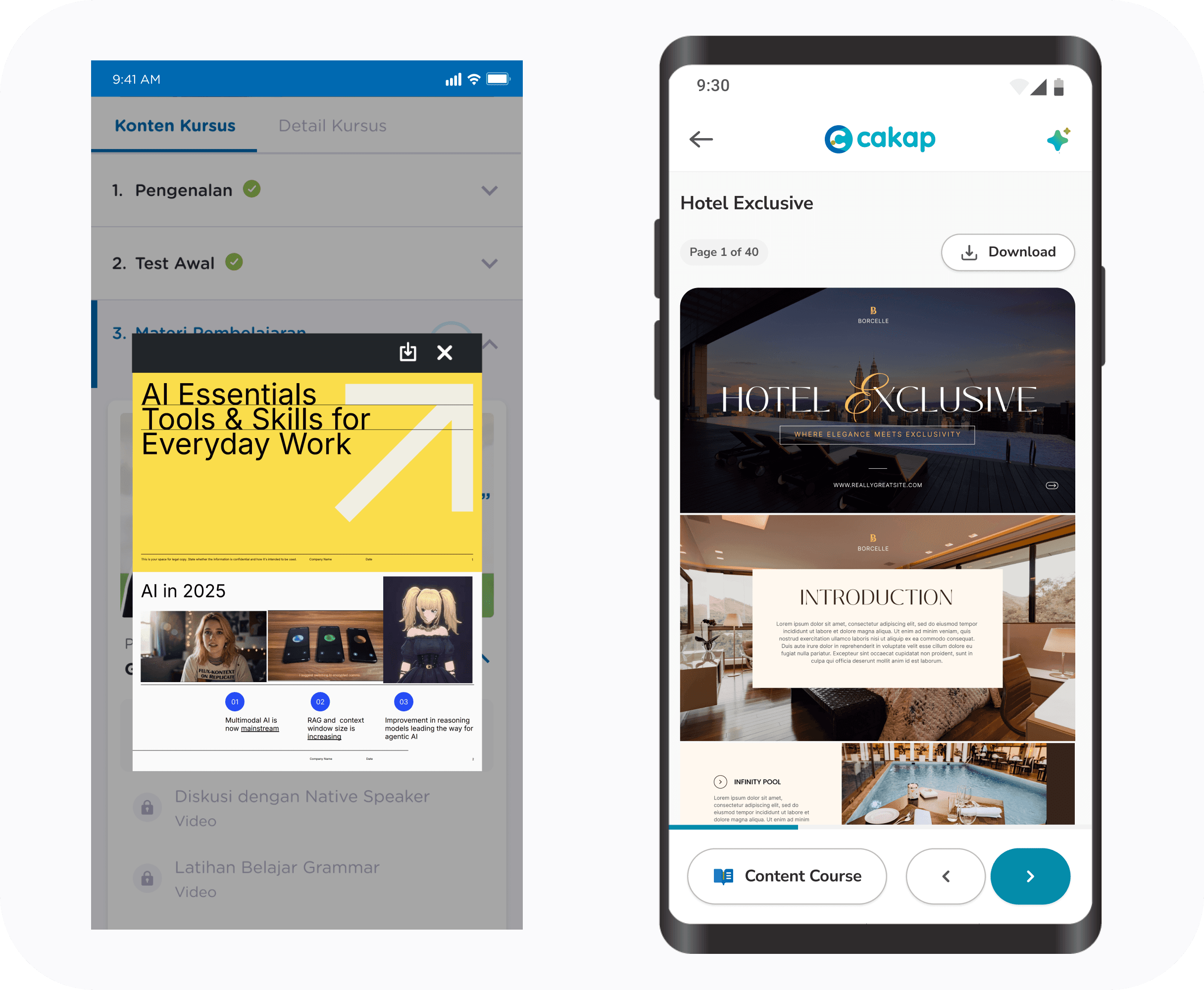
Reading Material

Live Class in COurse
AI Feature

certificate
Key Learning
The testing changed more than the layout. It changed my understanding of what learners actually needed. Initially, I believed the problem was navigation discoverability. In reality, the research revealed two deeper behavioral insights:
Learners naturally anchor their attention around controls that are easiest to reach.
Learners seek constant reassurance that they are progressing, not simply a way to move between pages.
Designing around those behaviors not around the original interface resulted in a learning experience that felt more intuitive while reducing unnecessary cognitive and physical effort.