Whatsapp Automation
MVP for WhatsApp commerce but a UI that couldn't scale past a demo. I redesigned the seller dashboard and customer order flow so the product was ready for development handoff and for sellers who'd never used an admin tool before.
Role - Team
UIUX Designer - Stakeholder, PM, UX Writer.
Date
March - April 2021
The Context
Halosis lets small businesses sell through WhatsApp: customers order in-chat, sellers manage everything chatbot rules, customer tags, order history, agent performance from a web dashboard. The MVP proved the concept worked. It didn't prove the dashboard could hold up once real sellers, most of them non-technical, tried to run a business through it.

The Goal
The gap showed up in specifics: the bot-driven chat flow surfaced raw menu inputs to agents instead of the intent behind them, order status was carried entirely through color with no label pattern behind it, and admin actions like tagging or assigning an agent had no prompt explaining why a seller would bother. None of that breaks a demo. All of it breaks the first week a seller runs the tool without someone from Halosis standing over their shoulder.

Constraint
The platform needed to go straight into development after this pass. No room for a second discovery round decisions had to be defensible on the first try.


Who I designed for
The asymmetry mattered one side needed depth (analytics, multi-admin tracking, tagging), the other needed the opposite a link that just works, with zero learning curve. Two very different users sharing one system:

Sellers
Small business owners, most running the shop themselves, using the dashboard to manage chats, tag customers, track admin activity, and read performance analytics. Low tolerance for admin-tool complexity; they're not IT staff.

Customers
Ordering entirely inside a WhatsApp chat thread, with a single touchpoint outside the chat: a link to their order history.

What I did
The asymmetry mattered one side needed depth (analytics, multi-admin tracking, tagging), the other needed the opposite a link that just works, with zero learning curve. Two very different users sharing one system:
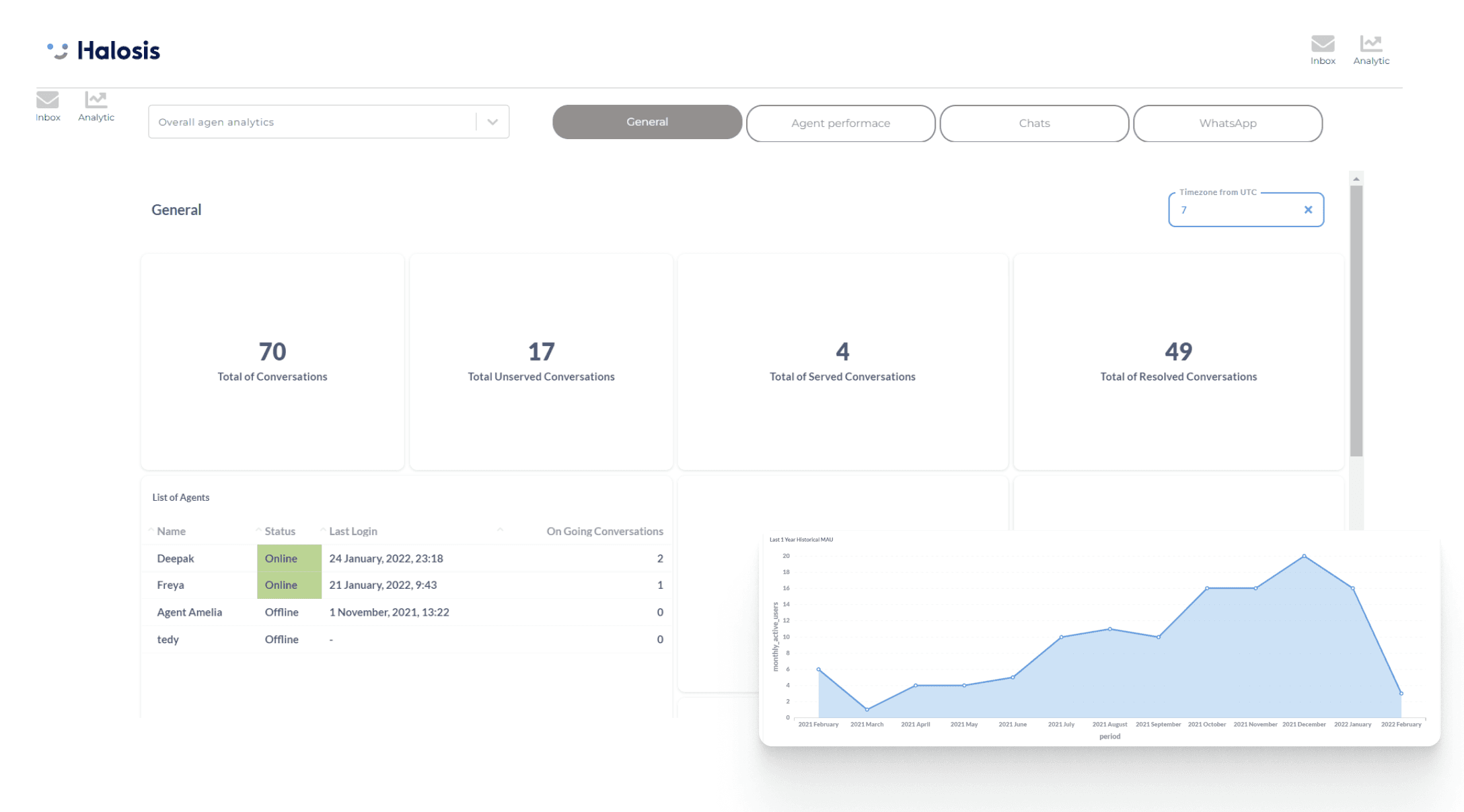
Sellers Dashboard
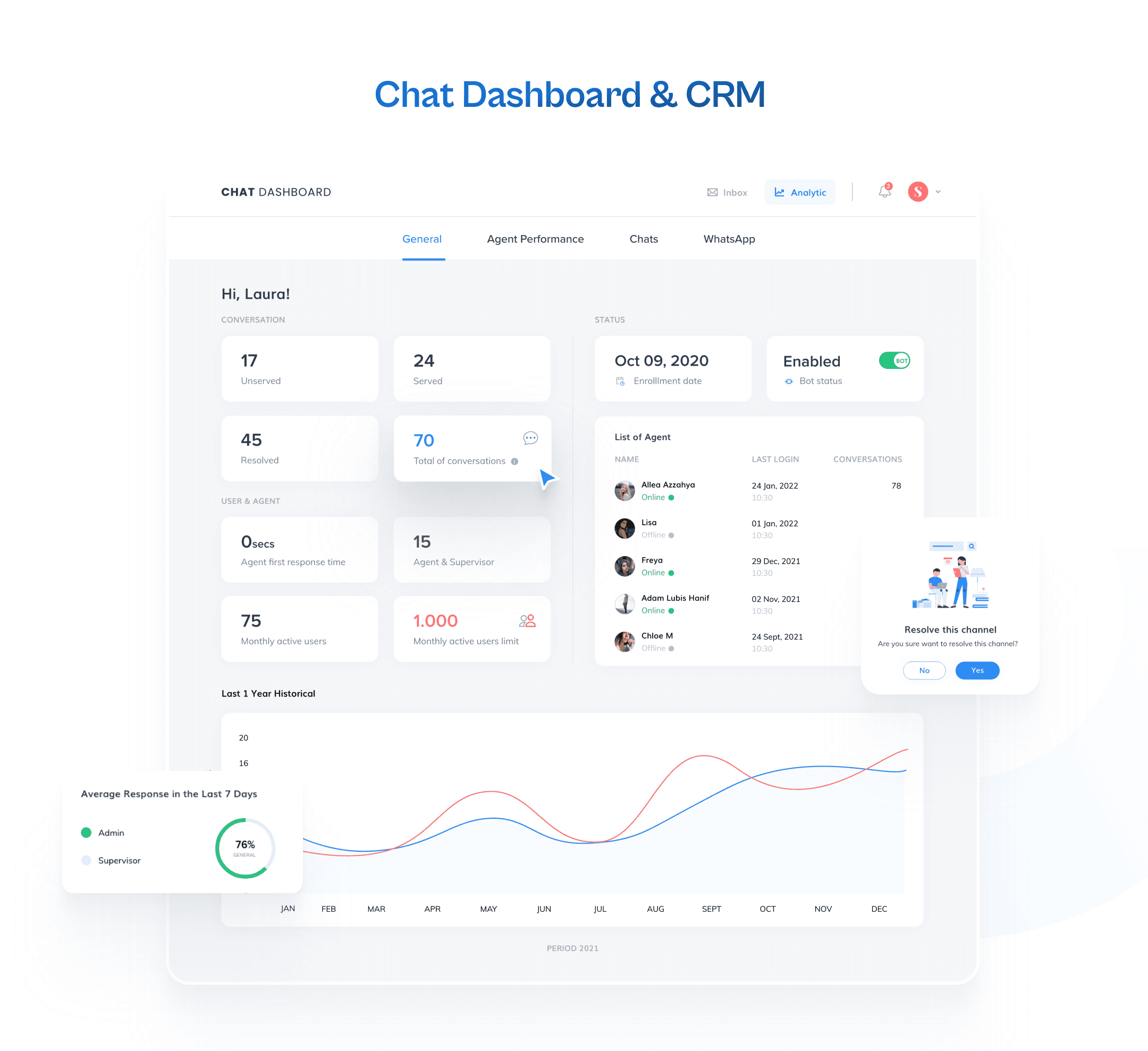
Chatbot management: customer info, tags, notes, and multi-admin access in one view
Analytics: general performance, per-agent performance, and chat-level data
Admin accountability: every action traceable to the admin who took.
Customer Side
A standalone order-history view, reachable via a link sent in the WhatsApp thread no login flow layered on top of a chat-native experience
Design System
Built alongside the screens, not after, since the deliverable was a dev-ready handoff, not a set of static comps
What I'd do differently
Looking at the shipped screens now, a few gaps are visible that I'd fix on a second pass: order status is carried entirely through color with no label reinforcing it, which fails for anyone with low vision or a dim screen. The resolve-note popup renders anchored to the conversation list rather than the open thread, breaking the visual link between the action and what triggered it.
And the empty states are inconsistent some panels get an illustration and copy, others (Average Resolve Time, Average Response Time) just render blank. None of these are big rebuilds, but they're the kind of detail a second design pass, or five minutes with an actual seller, would have caught before dev handoff.